

Upcoming Ticket Improvements & Additions
We are super stoked to be deploying a significant ticket-related update today. As you know, tickets are the heart and soul of Unfuddle. Whether you use them to track bugs or plan your projects, tickets are what you use to get things done.
We have been working hard to pave the way for some useful and much asked for ticket-related features in Unfuddle, including custom ticket statuses and task boards. Of course, anything that affects a core part of Unfuddle requires a lot of thought and a good dose of feedback from our customers.
We've already given this a lot of thought but that doesn't mean it's perfect. Now we are revealing an updated ticket view in all Unfuddle accounts so you can share your thoughts with us. You won't see custom ticket statuses or task boards yet, but, as stated above, this update is necessary for us to make a smooth introduction of those features in the coming weeks.
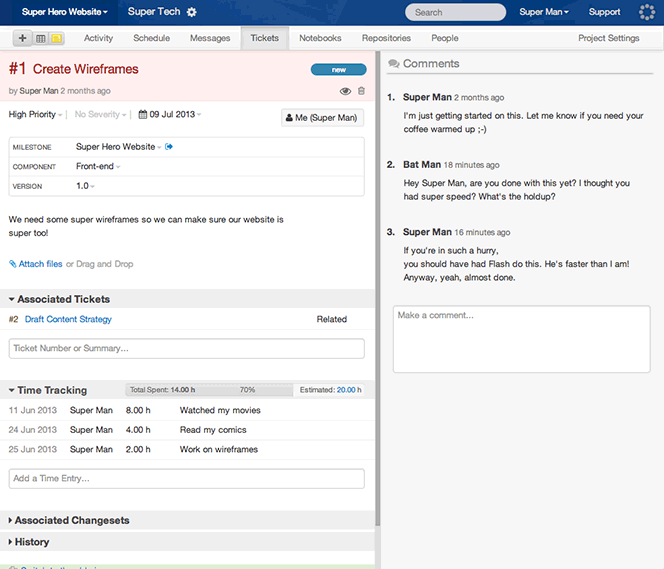
Since the ticket view is so core to many of your workflows, we are not yet retiring the "old" version. In fact, it is still the default view for now. However, you can toggle the views easily right from within the interface.

We want to make sure this update improves your workflow and makes Unfuddle even easier to use and more helpful to you and your team. And the only way for us make that happen is if you give us your feedback!
Please use the feedback form in your account to send us your comments and questions. We will read and respond to all, as always. And, oh yeah, did we mention that custom statuses and task boards are coming to Unfuddle?!
Love the new update! Only thing i'm missing is the "My Active Tickets" link that used to appear on the current ticket version
I am missing the resolution description.
I am missing the report title and link to the currently selected report in the upper right hand corner of each ticket.
Awesome work guys - keep it up!
Just to help out (not to complain!) there are a few things missing (some already reported):
Comment box:
- Right click doesn't have a 'paste' option by the looks.
- Markdown/Textile/etc dropdown box is not tall enough in Chrome
Ticket Priorities:
- Cannot be edited from within the ticket for most tickets (couldn't figure out what the pattern is but some can be edited, most can't)
Time tracking:
- If the list is long, it can be hard to select the last person in the dropdown menu. Personally with this new and improved UI I'd put the Time Tracking above the Associated Tickets or even better have this customisable (also if the menu is open or closed by default).
- If there is a LONG list of time entries on a particular ticket it would make more sense to have the actual entry field for the time at the top rather than bottom. I personally would benefit from this.
- The progress bar is very "boring" now and I also wonder what happened to the initial vs current fields.
Suggestion:
- If component and version are not being used they should be omitted for a tickets of a particular project to save space.
Hope that helps and once again Kudos for a great improvement!!
PS: Re this:
Time tracking:
- If the list is long, it can be hard to select the last person in the dropdown menu. Personally with this new and improved UI I'd put the Time Tracking above the Associated Tickets or even better have this customisable (also if the menu is open or closed by default).
This is a problem when the two menu items below are not opened so the scrolling is limited.
HTH!
www.idalo.io
Update looks great!!
One thing I noticed:
Associated changesets should stay expanded if I have expanded it once. (e.g. track it in a cookie)
I would like to be able to see everything on one page when I open a ticket. I know this can be overwhelming to new users but for experienced users (what I claim most bug tracking tool users are) who already have a fixed pattern how they scan a page to find what they are looking for, it is better if every thing is expanded.
My use case is when I decide if tickets can be closed I check if the last commits are there.
I find the new interface difficult to use. There is too much on the screen at once making it distracting and hard to find what I need to. In addition, I was unable to find the Resolve and Close key.
The previous yellow header was clear and defined but the new look does not have this feature.
1) cant fast navigation to "My Active Tickets"
2) cant see status, acceptee, priority e.t.c. in "Associated Tickets"
Yes, good moves!
One thing is missing IMO.
The "My Active Tickets" link must be still present in the ticket detail page.
you have the small down arrow on many of the items that can be picked - except changing the status. The 'new' looks like a button which is fine but its only when I moved the mouse over it did I realise this was where I could resolve a ticket. I switched back to the old site just to do that - but now I see.
maybe have the down arrow on that all the time, list it is on other items.
The new view does not allow me to change the priority of tickets created by someone else. Earlier I could click 'Edit' to change it.
Win 7 Chrome (I see dropdowns in your screenshots) but can't see on my browser window.
Immediate changes is not too good. "Save" button would be great.
And it's now not cleare where to add the resolution text when resolving the ticket.
Under ordinary circumstances I'd be inclined to let the normal process of back-and-forth between users and devs refine and finalize the new ticket interface before I use it. However, yielding to a casual desire to check out the new interface now has locked me into it, and nothing I do can get me back to the old one. Is there anyway to undo my accidental conversion? And if not, perhaps the "Check out the updated view" link ought to be changed, at least to warn that once you do, you can't go back? Thanks.
In general I like it, but it's missing the following essential items:
1) Resolution Comments
2) Resolution : (i.e. Fixed/ Works for me / postponed / duplicate/ will not fix / invalid
3) Easy links back to ticket reports
Thanks
Stuart
To be honest, I'd rather prefer fixing that annoying bug with all comments being treated as textile regardless of the REAL formatting used, which I reported a while ago.
I'm using Chrome 27.0.1453.116 and I notice that when my browser window's width is 960px, the comments form is cut-off slightly so that some text is hidden. Can you make the new ticket view more responsive so that the left "information" column's width decreases to allow the comment form to fully visible up to 960px (which is a very common window width). In my opinion, at anything smaller than 960px, the comment form should clear and get pushed below the information column.
The form to enter a new time entry should remain at the TOP of the list of time entries because this list can become long and it's annoying to scroll down to enter a new one. Also, I think the list of time entries should be sorted so that the most recent entry is at the top by default.
Otherwise it's looking good. I like the in-line editing features.
I like the new placement of 'Comments' at the top next to the ticket notes, but please consider making the width of the comments column adjustable and possibly collapsible if desired. It takes up a lot of space on the right side and if there's nothing in the comments, it's a lot of empty space that would best be utilized by the ticket notes if that's what I'm focused on.
Conversely, if there are a lot of ticket notes and a lot of comments and I need to focus on one section only, I can see where the side-by-side might cause a visual overload. Adjustable width would solve this.
Also, reiterating the other commentators about missing 'resolution notes'. Other than that... nice improvements!
It looks good but easy access to reports (like other have already mentioned) would be good.
Also, it seems that I can no longer move a ticket from one project to another (it was possible in the old UI).
I closed the "invitation" to see the new ticket layout and now I can't find out how to turn it on.
I seem to recall that before reverting to the old view, I had noticed that when viewing tickets from a report, I had lost the ability to go to the next/previous ticket without returning to the report.
I'm missing the "Verify and Close" option from a resolved ticket.
Thanks everyone for your comments so far. Clearly Tickets are an important part of Unfuddle to all of you!
@Bob Schroeck and others who wish to switch back to the old view. You can do this at the bottom of the page. You will see a little green box with a link to "Switch to the old view." You can switch between them as often as you like.
Of course, more updates are on their way. We have a lot of thoughtful feedback to process and act on. Keep it coming!
Don't know if someone already brought this up, but I want to be able to cycle between tickets quickly using the link at the top. For example, I click "My Tickets to Verify" and then review, resolve, and click next.
Totally digging this new layout. Feels like an application instead of a website on steroids. Kudos!
Echoing a comment above:
"Also, it seems that I can no longer move a ticket from one project to another (it was possible in the old UI)."
This is pretty crucial to our workflow as we use a separate Estimates project and then move the ticket into the relevant client project when the estimate is approved.
Keep up the awesome work! It's great to see you investing in Unfuddle.
It's a nice change to the UI (especially the comments), but there are a few things I miss from the old version:
* Ability to see the last selected view (report) and a link to go back to that view. Now if I click [ Tickets ] it will take me to the default (first) view, which is not always the one that we (as developers) use.
* Ability to cycle between tickets within a selected view (please see screenshot here: http://prntscr.com/1ed89s)
Thank you
Michal
It is beautiful. But what is missing for me is a way to either move the border between the two columns, or else to "maximize" the left or right side.
The reason is that in my work, we use the comments section extensively for discussion about current issues. Whereas before, I had the whole screen to see and edit comments, now I appear to only have about 40% of it. I use a *large* monitor, because I find having lots of screen space makes me more productive. This new restriction is like getting down-graded to a small monitor again when I'm working on unfuddle tickets.
Hm... yes, looking at the new layout again, I'm realizing that there are a lot of things that are now front-and-center on my screen at all times which I don't care about that much:
- I rarely use "associated change sets"
- we don't use time-tracking at all
- associated tickets is a nice feature of unfuddle, but it's not so important to me that I want to be able to see it on my screen all the time (particularly if it's at the expense of screenspace for other things that I care more about)
- the box with "Milestone/component/version"/etc in particular takes up a giant amount of screenspace while conveying only a tiny amount of information.
I love all of these features -- just not that they continue to take up my screenspace now even after I'm done looking at them.
I need burndown charts and metrics before I need new views!
When I create a ticket and choose a priority (Example: Highest) during the creation, after the ticket is being created the priority is reset to Normal. I need to edit the ticket to make it Highest priority again.
The comments area is now only half the screen width, and when adding a comment, the input and preview areas are less than a quarter of the width. The way we use comments here will make this a real severe problem for us; the preview won't show layout anything like it will actually appear and we often need to enter tabular info in here.
It also means we lose the "submenu" of all active / my active / pending closure etc tickets that previously allowed us to work on one ticket then with a single click jump straight back to our own queue. The new layout means we'll need two (slow) page loads, with the first one showing ALL tickets (including all the ones we KNOW we're not interested in) before we can drill down to our own work queue.
Please reconsider!
(Or at least give us the option to continue using the current layout)
Oh, and will this fix the MAJOR bug where any new comments are not shown until you hit F5? This STILL catches me out everytime; I get notified by a user they've added a comment, go to the ticket or follow the link, the the new comment isn't there. Winds me up no end and unleashes abuse on the poor end-user, as the comment's actually there, it's just unfuddle won't show it to me! Aagggggghhhhhhhhhhh.
The new ticket summary page is a nice improvement. The "button" that displays the status of the ticket in the top right of the page should be a consistent interface w/ the rest of the page. A "button" indicates the element performs an action which is not the case w/ this element. The purpose of the element is to indicate and change the status of the ticket.
This element should be similar to the Priority, Resolution, etc. where the small down arrow is visible all the time indicating an option can be selected. The visual appearance should be just text rather than look like a button. Maybe color the text based upon the status and make it bold to stand out. In addition, there could be a small icon next to the text to indicate the status which would make it stand out more.
Same comment for the User element as for the status mentioned above. Make it's visual appearance something other than a button. Also, the small down arrow does not work for this element whereas it does for the other "lists".
Make the "Edit" icon for the text of the ticket visible at all times. The user should know what all the actions are on a page by looking at the page rather than having to move the cursor over an item to see the element for an action.
You should integrate the Resolve Ticket date in the Comma Separated List (CSV) report.
Removing a time entry failed on me twice (twice the same time entry, one attempt right after the other). I got a small popup with red text stating something went wrong.
Hey,
Thanks for asking feedback from your users. I appreciate ;-) Here is mine after several days of using this new version:
You sometimes create a ticket, and then have no access to the "Save" button at the bottom of the screen (the scroll sometimes freezes, even if you are in the correct frame). Then you are obliged to zoom out several times to make the button visible and be able to click it.
Most of the changes done inside the new tickets are not notified anymore to the users (reassignment, ticket closed or reopened...)
The status of the ticket, and who it is assigned to are less visible that they used to be (I keep on "searching" for them)
History is closed by default - i use it a lot and it bothers me to be obliged to open it each time...
When you arrive on a ticket from a report, you can't see the link to that report at the top of the page - as it used to appear before.
I feel a bit sorry to say that i preferred the previous version. This one is graphically nicer but I like it less regarding my personal use & habits... I tried to get used to it, forcing myself to use it during several days... But I'm happy that i can (still...) come back to the former version for the moment.
I agree with what Rodrigo wrote: "Also, it seems that I can no longer move a ticket from one project to another (it was possible in the old UI)."
Yes! this is key for us too!... ;-)
Is there a way to insert "Description of Resolution" on the new interface?
Are you planning to include this feature?
Thanks!