UI Updates and The New Board in Unfuddle STACK

You may recall that, in response to our survey earlier this year, we committed to some pretty significant updates to Unfuddle STACK. We started by implementing sweeping performance improvements. And now we are doubling down on our commitments by releasing a very exciting, and very visible update to the user interface.
Revamping the entire interface of STACK was no easy task. We knew that we needed to respect the workflows that many of you have used for years. But we also needed to modernize the interface and bring uniformity across the various pillars of the application.
Please allow us to share with you some of the significant usability improvements we have been working on.
Board View

We will start with the update that most of you will likely appreciate the most. Unfuddle STACK now has a full-featured, flexible board integrated directly in ticket reports. While a board is not technically a new concept in STACK, this update brings significant changes and improvements:
Notebooks

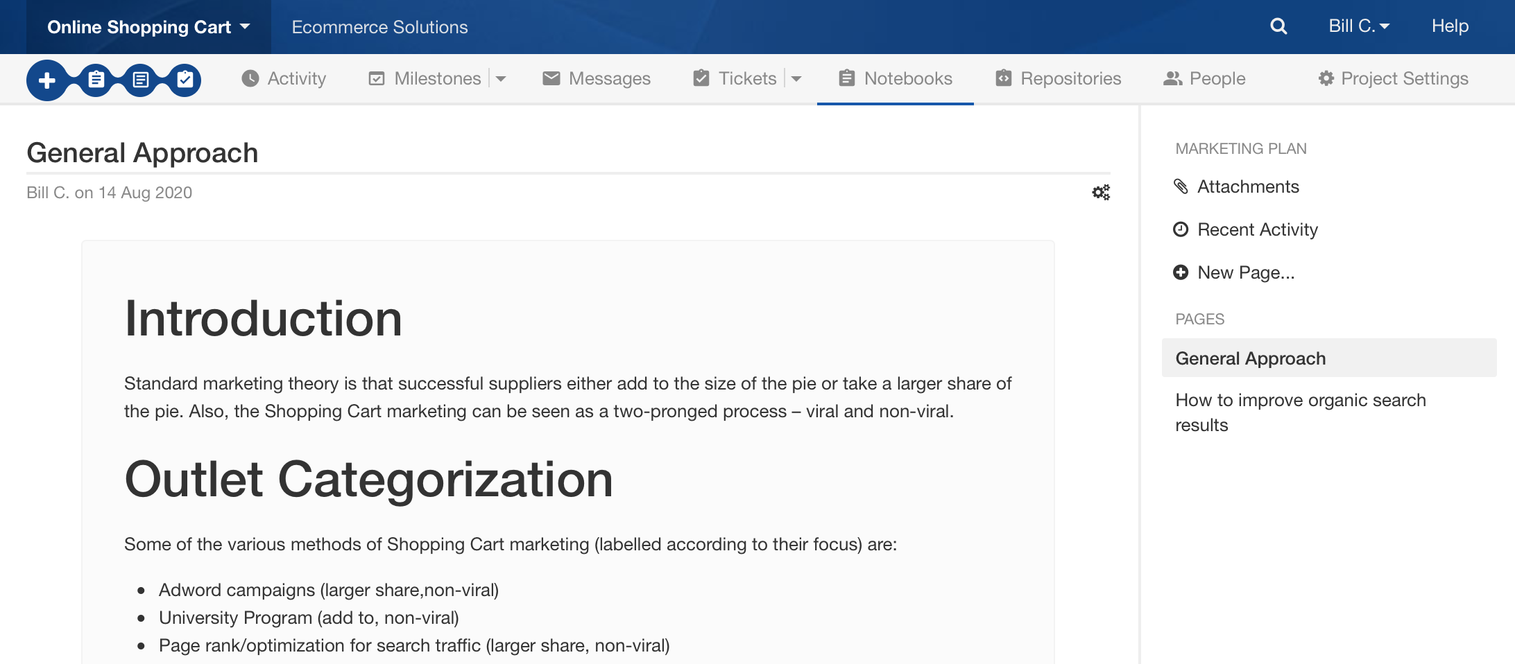
Notebooks are STACK’s take on a wiki for your projects. However, they have always seemed to lag behind the rest of the application with regard to usability. While the data itself was well structured, the interface was not very helpful with browsing through the pages of a notebook or editing.
Essentially, a notebook is just a collection of pages. And this is exactly how we are presenting them through this update. Browsing through the pages of a notebook is now easy, with filtering for quick find and without losing context.
Also, reading a page is now made much easier with standardized page width limits, spacing, and the new styling. We’ve also moved all nonessential interface elements out of the way. It’s like a breath of fresh air.
People and Settings Pages

The People tab has been completely refactored to something more of a list view. Details about individuals can be seen at a glance. Overall, it is SO much easier to use, especially if you have a lot of people in your account.
We have reorganized the Personal and Account Settings pages so everything is now more intuitive and easier to find. If you are an account admin, the Account Settings page can be accessed in the dropdown under you name, or at the right of the navigation bar when browsing the Account Dashboard - All Projects section.
General Look and Feel
In addition to the above mentioned feature updates, we are sure that you will notice that we have completely polished and modernized our interface, aiming for consistency, usability and beauty. While we understand an interface can never be perfect, we think we have found a good direction for improvement. Everything is now easier to read and more consistent across different areas of the interface. You will find many small surprises that make everyday use just better.
Thank You
From all of us here at Unfuddle, we want to thank you for your continued loyalty. We love building tools that make your projects come to life. And we are working hard to continue to bring even more great improvements to Unfuddle later this year.
Stay safe and healthy,
The Unfuddle Team